

Let’s talk about photography composition.
If you’ve ever looked at a breathtaking photo and wondered why it just works, or if you’ve ever stood in front of a gorgeous landscape only to look at your camera screen and think, “Why does this look so flat?”, you are in the right place. Grab a coffee, and let’s hang out for a bit.
Before we dive into the nitty-gritty, I want you to know that this journey we’re about to take is equal parts technical precision and total creative freedom. You can buy the most expensive lens on the market, but the real magic happens when your photography composition clicks. It’s where the science of your camera meets the soul of your art. It’s how we arrange the world inside a little rectangular box to not just show people what we saw, but to make them feel what we felt.
At its core, composition is just the deliberate arrangement of elements in your frame. It’s the visual language that turns a quick snapshot into a story. And while we’re going to cover a lot of “rules” today, remember that photography thrives on your personal interpretation. These guidelines have stuck around for generations because they tap into how human brains naturally process visual information. But they are meant to be learned, respected, and eventually, purposefully broken.
Early on, thinking about photography composition can feel a bit like doing math. You’re mentally drawing grid lines and tallying up visual weight. But stick with it. Over time, these rules sink into your muscle memory. Composing an image will eventually become as natural as breathing, and your eye will just intuitively find the harmony.
The Classics: Foundational Rules (And Why They Work)
The Rule of Thirds: Finding the Sweet Spot
This is the big one. Imagine your camera screen divided into nine equal rectangles by two horizontal and two vertical lines (most cameras actually have a setting to display this grid for you!). The rule of thirds suggests placing your main subject along those lines or, even better, right where they intersect.
Why? Because dead-centre subjects can sometimes feel a bit static. Placing them slightly off-centre creates a sense of dynamic tension and interest. It just feels more natural to the human eye. But a quick word of warning: don’t let the rule of thirds become a crutch. Sometimes, leaving a ton of space on one side is exactly what the photo needs. Learn the rule so you know exactly when to ignore it.
Negative Space: Embracing the Empty Room
One of my absolute favourite tricks is using negative space—the empty, uncluttered areas surrounding your subject. This isn’t just “dead space”; it’s an active part of your photo that gives your subject room to breathe.
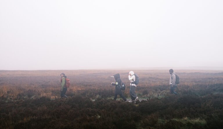
Try letting the negative space take up at least 50% of your frame. Think of a tiny silhouette of a hiker against a massive, empty sky. That emptiness doesn’t just show scale; it evokes deep feelings of solitude, freedom, or peace. The silence in the frame speaks volumes.
Leading Lines: Guiding the Eye
Our eyes are naturally lazy; they want to be led. By using leading lines, you can build a visual highway that pulls the viewer right into your photo and drops them at your focal point.
These lines can be anything: a winding dirt road, a curving river, the converging edges of a bridge, or even a row of fence posts. Straight lines feel direct and fast, while curvy lines feel relaxed and graceful. Use them to control exactly how someone looks at your image.
Symmetry, Patterns, and Balance
We are hardwired to love symmetry and patterns. Finding a perfect reflection in a still lake or a repeating row of townhouses is incredibly satisfying. But here’s a pro tip: the real magic happens when you break the pattern. A sea of red umbrellas with one bright yellow one in the middle? Instant masterpiece.
Also, remember that balance doesn’t always mean perfect symmetry. You can balance “visual weight.” If you have a large, dark subject on the left, you might balance it with a smaller, brightly lit subject on the right.
The Golden Triangle: Adding Some Drama
If the rule of thirds feels a bit too safe and you want to inject some serious energy into your shot, try the golden triangle. Instead of a grid, imagine a diagonal line slicing from one corner of your frame to the opposite corner. Then, draw lines from the other two corners to meet that main diagonal at perfect 90-degree angles.
Placing your subjects along these diagonals creates a fantastic sense of movement. It’s brilliant for action shots, architecture, or anytime you want the photo to feel like it’s leaning forward.
Framing Within the Frame
Want to add instant depth to a 2D image? Shoot through something. Use a doorway, an arching tree branch, or a window to create a natural frame around your subject. It makes the viewer feel like they are peeking into a secret world, adding layers and a beautiful 3D quality to your work.
Levelling Up: Depth and Perspective
Creating Depth
Nobody likes a flat photo. To make your images feel immersive, try to include distinct foreground, middle ground, and background elements. Ask yourself: What can I put right in front of the lens to anchor the shot? A textured rock, some wildflowers, or a leading line starting at your feet can make the viewer feel like they could step right into the picture.
Changing Your Viewpoint
Most of us take photos from eye level because, well, that’s where our eyes are. But moving your feet changes everything. Get down in the mud and shoot from a worm’s-eye view to make a subject look towering and heroic. Climb up high for a bird’s-eye view to show the layout of a scene. Your physical perspective tells the viewer how to feel about the subject.
Watching Your Backgrounds
The background is the silent killer of good photos. Before you press the shutter, do a quick “background sweep.” Is there a trash can right behind your friend’s head? Is a tree branch looking like it’s growing out of their shoulder? Take a step to the left, change your angle, or open up your aperture to blur the background out. What you choose to exclude is just as important as what you include.
The Vibe: Emotion and Visual Weight
Evoking Mood
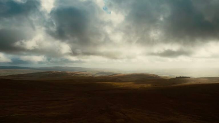
Every compositional choice carries an emotional heartbeat. Centred, symmetrical shots feel formal, stable, and strong. Diagonal lines feel chaotic, fast, and tense. Wide, empty spaces feel lonely or contemplative. Before you shoot, ask yourself: How do I want the person looking at this to feel?
Visual Weight
Not all elements in a photo are created equal. Dark, heavily saturated colours feel “heavy” and draw the eye immediately. Light, desaturated pastels feel “light.” High-contrast areas demand attention. Use this visual hierarchy to balance your frame and guide the viewer’s eye exactly where you want it to go.
The Philosophy: Breaking the Mould
Breaking Rules With Purpose
Photography is a dance between following the map and wandering off the trail. But here’s the secret to great photography composition: you have to know the rules before you can break them. Breaking rules out of ignorance just looks messy. Breaking them with intention looks like genius. Once you understand why the rule of thirds works, you’ll know exactly when a dead-centre, symmetrical portrait will hit ten times harder.
Visual Poetry
At its heart, composition is visual poetry. Just as a poet chooses words for their rhythm and weight, you are arranging light, shadow, and shape to tell a deeper truth. Your compositional choices are your fingerprint. They show the world not just what you saw, but how you see.
Practical Tips to Get Better Today
Simplify and Clarify: When in doubt, zoom in or step closer. Remove the clutter. A clean, simple composition with one clear focal point will almost always beat a busy, chaotic one.
Think Conceptually: Don’t just shoot things because they are pretty. Ask yourself: What is this photo actually about? Let the story dictate how you frame the shot.
Don’t Fear the Crop: We all want to get it perfect in-camera, but there is zero shame in cropping in post-production. Use your editing software to refine your composition, straighten horizons, or chop out distracting elements at the edges.
Finding Your Compositional Voice
As we conclude, remember that these rules and guidelines are meant to serve your vision, not constrain it. The journey to improving composition is both technical and deeply personal. It requires understanding these principles so thoroughly that they become second nature, allowing your intuitive, emotional response to take centre stage.
Composition isn’t just about arranging elements pleasingly – it’s about arranging them in a way that reflects your unique way of seeing the world. It’s about finding the visual language that allows you to tell the stories that only you can tell.
Practice these techniques until they become intuitive. Study the work of your favourite photographers to understand how they use composition to express their vision. But most importantly, shoot regularly and reflectively, developing an awareness of what draws your eye and how you can best translate that attraction into compelling images.