Metaphysic Inc.
Metaphysic engaged me to reimagine their corporate website so that complex generative AI solutions could be presented with clarity, authority, and seamless user journeys.
CASE STUDY | WEBSITE & COPY
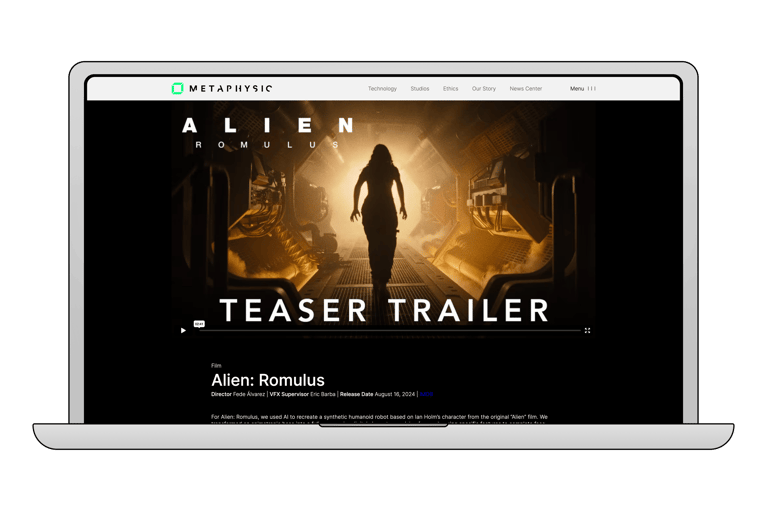
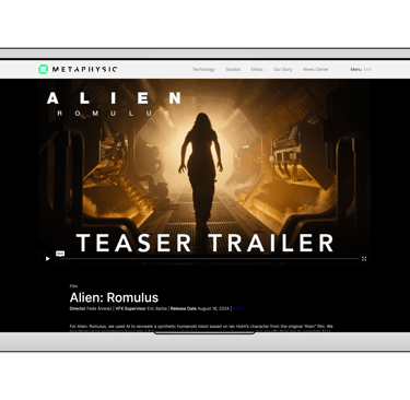
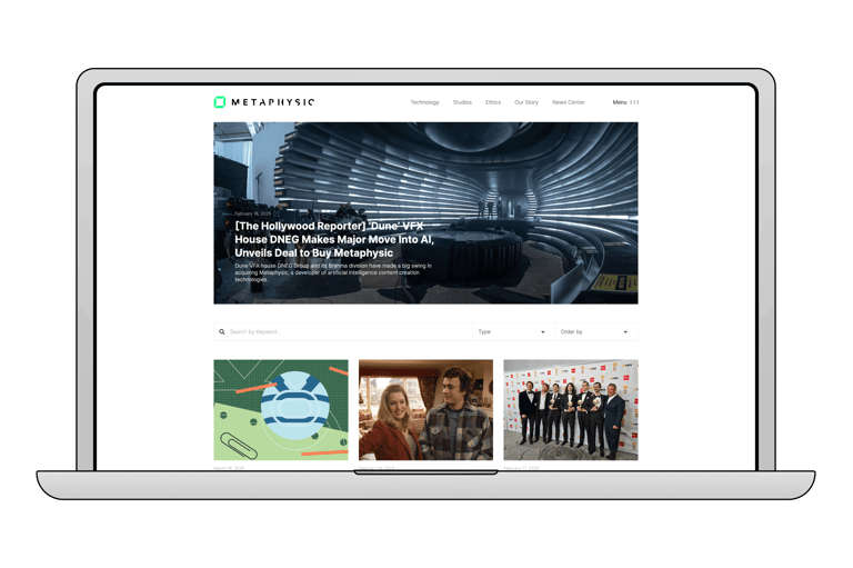
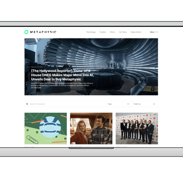
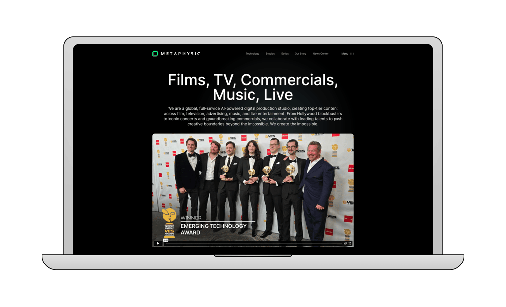
Metaphysic Website.
Project Overview
Interactive prototypes brought wireframes to life, enabling us to conduct usability tests that unearthed friction points and guided rapid iterations. By observing real users navigate key flows, we fine‑tuned layouts and interactions for maximum clarity and engagement.
Through stakeholder interviews, competitive analysis, and user surveys, I unearthed core user needs and business objectives, then translated them into a prioritised feature set and content strategy. Workshops with product and tech teams further refined our strategic vision.
I crafted a clear sitemap and mid‑fidelity wireframes to establish intuitive navigation paths and content hierarchies. Early validation sessions ensured that information flowed logically, reducing the need for later revisions.
Building on a “content‑first” approach, I defined typography scales, a cohesive colour palette, and reusable UI components that reinforced Metaphysic’s innovative brand identity. A modular design system then streamlined development and maintained consistency across every page.
Research & Strategy
Information Architecture & Wireframing
Visual Design & Branding
Prototyping & User Testing
Metaphysic engaged me to reimagine their corporate website so that complex generative AI solutions could be presented with clarity, authority, and seamless user journeys. I aligned the site’s scope and KPIS—lead generation, investor engagement, and market adoption—before charting a roadmap for the redesign.
Stakeholder Collaboration & Iteration
Bi‑weekly demos, design critiques, and cross‑functional feedback loops with executive stakeholders and engineering teams ensured alignment on narrative clarity and technical feasibility. This collaborative cadence kept the project on track and fostered shared ownership.
Launch & Analytics
When the new site went live, we embarked on an analytics‑driven journey that validated every design decision. Since launch:
- Overall traffic surged by 30%, confirming that our refreshed content and navigation truly resonated.
- 68% of new visitors hailed from the US—our primary target market—underscoring the precision of our messaging.
- Click‑through rates on key landing pages leapt from 2.1% to 4.3%, propelled by sharper headlines and compelling calls to action.
- Returning user sessions grew 25%, reflecting our content's heightened relevance and stickiness.
- The bounce rate dropped from 58% to 39%, proving that our streamlined structure and improved UX drew visitors deeper into the story.